Epidemiology · a 1927 theorem and the 1906 table it was fitted to
Twice the Excess
Does an epidemic stop at herd immunity? No: in the simplest model it peaks there and keeps going. Kermack and McKendrick worked it out in 1927: a small epidemic ends as far below the threshold as it began above it, twice the excess. Drag R0 and watch the overshoot (at R0 = 2.5 the threshold is 60% and the epidemic ends at 89.3%), try to stop it at the threshold, then put their famous curve back on the 1906 Bombay plague table it was fitted to.
The herd immunity threshold is usually stated as a single number: with a basic reproduction number R0, once a fraction 1 − 1/R0 of a population is immune, each case infects fewer than one other person on average, and the epidemic can no longer grow. At R0 = 2.5 that is 60%. It is easy to read "can no longer grow" as "stops". It does not stop. At the threshold there are more people infectious than at any other moment of the epidemic, and every one of them still passes it on to someone, just to fewer than one person each. The infections they cause on the way down are the overshoot.
Where the peak is
One epidemic, in the simplest model there is
still susceptible infectious now (scaled to its own peak)
The model is the one Kermack and McKendrick wrote down in 1927, in its simplest case: everyone mixes with everyone, every infection lasts the same average time, and recovery (or death) is permanent. Time here is measured in infectious periods. Nothing in the picture depends on anything else: the only dial is R0.
Wherever you put the slider, the gold peak sits exactly where the blue curve crosses the dashed line. That is not a coincidence of the drawing. The number infectious rises while each case replaces itself more than once, and each case replaces itself R0 × (share still susceptible) times; the moment that product reaches 1 is the moment the susceptible share reaches 1/R0, which is the moment 1 − 1/R0 have been infected. Kermack and McKendrick explained the same moment in words:
“By equation (29) this occurs when dy/dt = 0, that is when x = l/κ, or when the unaffected population has been reduced to its threshold value. Once the population is below this value, any particular infected individual has more chance of being removed by recovery or by death than of becoming a source of further infection, and so the epidemic commences to decrease.”W. O. Kermack and A. G. McKendrick, “A contribution to the mathematical theory of epidemics”, Proc. R. Soc. A 115 (1927), pp. 715 to 716. Their x is the number unaffected, l/κ the threshold.
Twice the excess
How far past the threshold does it go? For an epidemic that starts only a little above the threshold, Kermack and McKendrick gave an answer that is easy to remember:
“No epidemic can occur unless the population density exceeds this value, and if it does exceed the threshold value then the size of the epidemic will be, to a first approximation, equal to 2n, that is to twice the excess (if n is small as compared with N). And so at the end of the epidemic the population density will be just as far below the threshold density, as initially it was above it.”Kermack and McKendrick (1927), p. 715. N is the population, n its excess over the threshold.
Put in today's terms, the excess n is the herd immunity threshold itself: a population of N sits N(1 − 1/R0) above its threshold of N/R0. So "twice the excess" says that a small epidemic infects about twice the herd immunity threshold, and that half of all its infections happen after the peak. The exact answer is the root of z = 1 − e−R0·z, and the chart puts all three side by side.
Threshold, final size, and twice the excess
threshold 1 − 1/R0 exact final size twice the excess (dashed)
| R0 | threshold | ever infected | overshoot | share after the peak | twice the excess |
|---|---|---|---|---|---|
| 1.1 | 9.1% | 17.6% | 8.5 pts | 48% | 18.2% |
| 1.5 | 33.3% | 58.3% | 24.9 pts | 43% | 66.7% |
| 2 | 50.0% | 79.7% | 29.7 pts | 37% | 100.0% |
| 2.5 | 60.0% | 89.3% | 29.3 pts | 33% | 120.0% |
| 3 | 66.7% | 94.0% | 27.4 pts | 29% | 133.3% |
| 5 | 80.0% | 99.3% | 19.3 pts | 19% | 160.0% |
| 10 | 90.0% | 100.0% | 10.0 pts | 10% | 180.0% |
Near R0 = 1 the rule is very good: at 1.1 it says 18.2% against an exact 17.6%. By R0 = 2 it says everyone, and past that it says more than everyone. The overshoot, measured in points, is largest in the middle (about 30 points between R0 = 2 and 2.5) and shrinks at high R0 only because there is nobody left to overshoot into. Measured as a share of all infections it falls steadily from one half.
One small thing the chart does not show. On the same page Kermack and McKendrick also give a refined size, 2n − 2n²/N, which in fractions is 2h(1 − h) for a threshold h. It is the exact size of their own quadratic approximation, and it is not a better answer than plain twice the excess. Written in powers of ε = R0 − 1, the exact size is 2ε − (8/3)ε² + …; twice the excess is 2ε − 2ε² + …, and the refined form is 2ε − 4ε² + …. Both are right to first order, and at second order the plain rule is the closer of the two (at R0 = 1.1: exact 17.6%, plain 18.2%, refined 16.5%). The check prints all three expansions against the numbers.
Can you stop it at the threshold?
If the overshoot is made of infections that happen after the peak, it seems it should be possible to cut them out: damp transmission for a while (fewer contacts, however achieved) and let go once the threshold is reached. Try it. The damping multiplies transmission by the strength you choose, starting and ending when you say; afterwards R0 is back where it was, for good.
One temporary damping, at the R0 set above
still susceptible infectious, damped infectious, undamped (dashed)
You can get close. You cannot get under. At R0 = 2.5 and 60% strength, the best of 1,600 timings the search tries ends at 60.01% against a threshold of 60%, and no strength does better than the threshold. The reason is short enough to state whole. When the damping lifts, either the susceptible share is still above 1/R0, and then any remaining infection grows again and carries it below; or it is already below, and then it only falls further. Either way, as long as any infection is left, the model's epidemic ends with less than 1/R0 still susceptible: more than the threshold ever infected. In the model's own terms the threshold is a floor that a temporary damping can approach and never cross.
Two honest limits on that. The first is in the readout: a hard enough damping for long enough leaves the model with, say, 10−17 of a population infected, and the equations then insist on a resurgence that no real city of a million people, holding no fraction of a person, would ever see. Real outbreaks can simply run out of cases. The second is that "afterwards R0 is back where it was" is doing a great deal of work: a vaccine, or any change that lasts, moves the threshold itself, which is a different thing from reaching it.
The curve everyone reprints
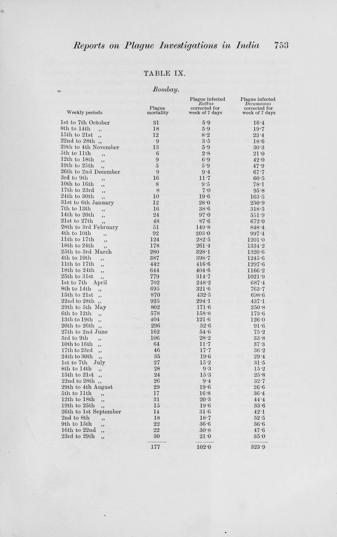
Kermack and McKendrick's paper has one picture of data. It is a curve laid over the weekly deaths from plague in Bombay (now Mumbai), from 17 December 1905 to 21 July 1906, and the curve is 890 sech²(0.2t − 3.4), the shape their approximate solution predicts for the rate of removals. Nicolas Bacaër, who went back to it in 2012, calls it one of the most reproduced figures in books on mathematical epidemiology. The paper gives no table. Bacaër traced the figures to a report of the Plague Research Commission printed in the Journal of Hygiene in 1907, and there it is, on page 753: Table IX, a year of weeks, with the plague-infected rats of two species beside the human deaths.
Table IX, Bombay, October 1905 to September 1906
Their plotted points are the table's numbers. The paper does not say where its t = 0 falls, but the figure does: measured off the printed chart, the week of 17 to 23 December sits at t = 1, and 925 at about t = 19, the pair near 700 at 16 and 17. (A first draft of this page put 17 December at t = 0, which slides their curve a week later against the deaths than they drew it; the outside check caught it, and the chart now follows their figure.) The 31 weeks they used hold 8,859 deaths; their curve, summed over all time, holds 2 × 890 / 0.2 = 8,900. It peaks at t = 17, two weeks before the table does. It is not the closest curve of its shape (a least-squares fit, which the page computes when you press the button, cuts the squared error by about a quarter), and the weeks do not follow it: the deaths rise to 779, dip to 702 and 695, then climb to 925. The table's black-rat column has its own two peaks, in the weeks of 11 March and 15 April.
They said plainly what they thought the fit was worth:
“We are, in fact, assuming that plague in man is a reflection of plague in rats, and that with respect to the rat (1) the uninfected population was uniformly susceptible; (2) that all susceptible rats in the island had an equal chance of being infected; (3) that the infectivity, recovery, and death rates were of constant value throughout the course of sickness of each rat; (4) that all cases ended fatally or became immune; and (5) that the flea population was so large that the condition approximated to one of contact infection. None of these assumptions are strictly fulfilled and consequently the numerical equation can only be a very rough approximation. A close fit is not to be expected, and deductions as to the actual values of the various constants should not be drawn.”Kermack and McKendrick (1927), p. 715.
What the fit asks you to believe
The curve has three numbers and the model has four (the starting susceptibles x₀ and infectives y₀, the contact rate and the removal rate), so the fit alone cannot say what the epidemic was. Bacaër fixed one and solved for the rest. Choose one first case, y₀ = 1, and the curve requires a population at risk of 57,368 people, each infectious for 1.6 days, with R0 = 1.09. Two first cases: 35,439 people, 3.0 days, 1.17. Three: 28,202, 4.3 days, 1.24. The page's engine does his algebra over again and gets his table back, to within one person (28,203 in the third row, where he prints 28,202). The census of February 1906, printed in the same report, counted 977,822 people on the island.
Run it the other way, starting from the whole island, and the same algebra gives R0 ≈ 224 with about 496,000 first cases, or R0 ≈ 1.0045 with 0.045 of a first case. Bacaër, doing this, reports 202 and 446,000, or 1.005 and 0.06. Those are the roots when the curve's height is first divided by 0.9 for the report's case fatality (A ≈ 989), a step his paper takes a paragraph later; in the version we read, the French translation on HAL, these figures come before it. Either way neither pair is possible, which was his point.
There is a simpler way to see the same wall, which needs no approximation. In this model the share ever infected, z, fixes R0 exactly: R0 = −ln(1 − z)/z. The report counts 12,245 plague attacks on the island in the year. Choose how many people were really at risk, and the relation says how close to 1 R0 had to be for the epidemic to stop there on its own. Then the deaths, which doubled about every 13.5 days from 17 December to 24 March, say how short each case's infectious period had to be for so thin a margin to grow that fast.
How many people were at risk?
With the whole island susceptible, R0 comes out at 1.0063 and the infectious period at about three hours. (That uses the simplest model's link between growth and R0, r = (R0 − 1)/T. If every case were instead infectious for exactly the same length of time, the figure roughly doubles, to about six hours. And the 12,245 attacks are a whole year's, not one season's, which errs toward a larger R0 and so a longer period: the true requirement is shorter still.) Read as a story about people, the curve says an island where plague was caught and passed on within an afternoon, or an island where most people could not catch it. Read as a story about rats, which is how Kermack and McKendrick meant it, the numbers belong to a population nobody counted, and the fit can neither be checked nor refuted by them.
What happened every spring
What the Commission could count was years. By 1908 it had ten of them for Bombay, and it drew them as one long chart, mean temperature and humidity above, plague deaths below:

“Since then the seasonal prevalence of plague in Bombay has been well marked and has shown little or no variation (Chart I). A study of the curve will show that each year the epidemic begins in January, gradually rises until it reaches its maximum in March, then rapidly declines until by the middle of May the plague mortality has returned to what it was before the epidemic.”Advisory Committee, “Reports on plague investigations in India, XXXI. On the seasonal prevalence of plague in India”, J. Hyg. 8 (1908), p. 267. The same page adds that in 1906 it “did not begin till February and was a little later in subsiding, namely the end of May.”
An epidemic that ended because it had used up its susceptibles has to wait for them to be replaced before it can come back. This one came back every year in the same months. The Commission's own experiments pointed at the flea, and at heat; and it wrote down, in the same breath, where that explanation ran out:
“1. A plague epidemic is checked when the mean daily temperature passes above 80° F. and especially when it reaches to 85° F. or 90° F. … 3. A plague epidemic may, however, come to an end when the temperature is most suitable. Other factors must, therefore, be present in these cases.”J. Hyg. 8 (1908), p. 287, from its “Conclusions as to the direct influence of temperature on the seasonal prevalence of plague”.
Bacaër's own reading of the reports is that 1906 “n’est vraiment pas un bon exemple” of an epidemic stopping because its susceptibles fell below a threshold, but an example of a seasonal epidemic, and he builds a model with rats, fleas and a yearly cycle to show it. This page does not settle what ended each Bombay season; it shows two things that do not depend on that. The threshold is where an epidemic of the simplest kind turns, not where it ends, and it ends, on its own, well beyond it. And the curve that became the textbook picture of that ending fits the Bombay deaths only on terms its own authors warned against reading literally, and which the report beside it makes very hard to believe.
The pages themselves
 J. Hyg. 7, p. 753: Table IX
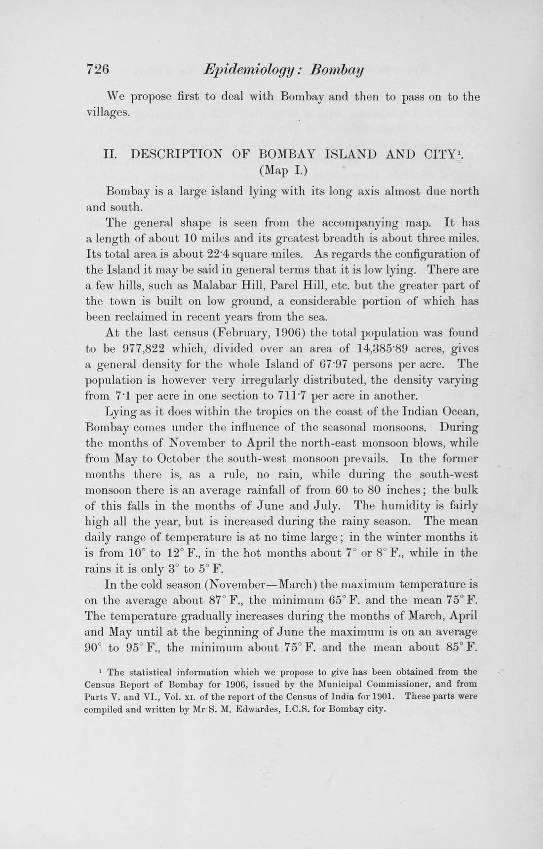 p. 726: the 1906 census
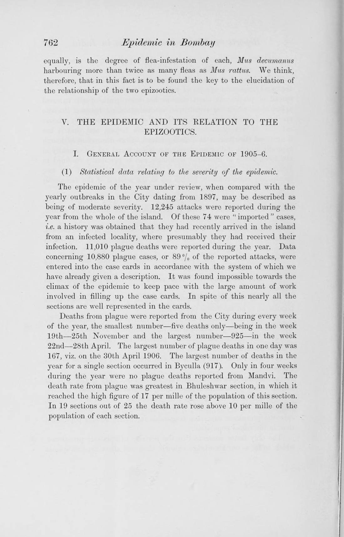 p. 762: 12,245 attacks
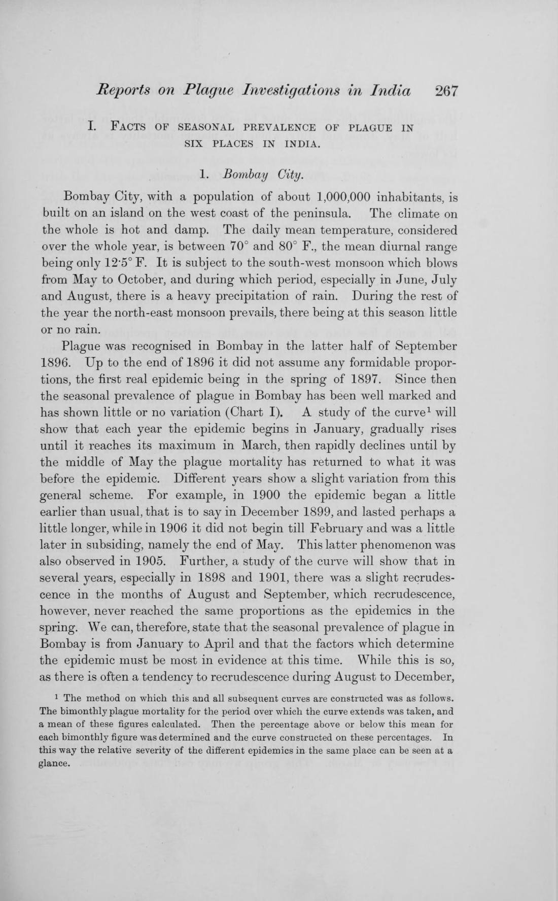 J. Hyg. 8, p. 267: every spring
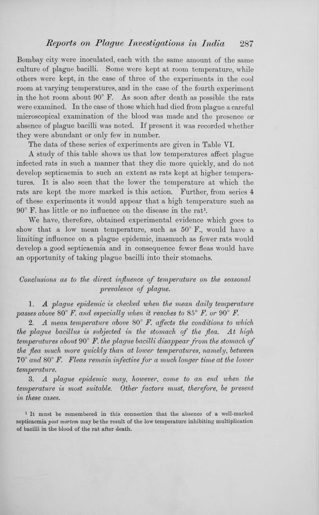 p. 287: the conclusions
Two small things the table says about itself. Its bottom row prints each column's weekly mean. For the deaths (177) and the black rats (102.0) the columns bear the means out, to rounding (177.3 and 102.1). For the brown rats the printed mean is 323.9 and the column's is 322.9, a difference of exactly one; every entry was read twice against the scan, and the Internet Archive's independent OCR of the page agrees with every one. The column's values are what the chart uses. And the 52 weeks of deaths add up to 9,219, where the report's text gives 11,010 plague deaths for the year on the whole island; a footnote to the city's rat chart says the data of certain northern sections were left out for a defective rat collection, which may be the difference, but the table does not say which sections its deaths column covers.
The check
- The model: a fourth-order Runge-Kutta solution of the SIR equations; the exact final size by Newton's method on z = 1 − e−R0·z; the simulated epidemic agrees with it to 10−6, and its peak falls where the susceptible share is 1/R0, for R0 from 1.2 to 8. The damping floor is checked both ways: 1,600 timings at each of five strengths never end below the threshold, and the exact end state after a damping (from ln s + R0·r being constant) matches a long simulation.
- Their figure: where each week sits on their time axis (17 December at t = 1) was measured off the printed figure on p. 714, by eye at 300 dpi, twice independently; it is the one input to the chart that is read from a picture rather than a table.
- The table: Table IX transcribed from the scan and compared value by value with the Internet Archive's OCR of the same page (all 156 numbers), plus the table's own printed means and the report's census density (977,822 over 14,385.89 acres is 67.97 per acre, as printed).
- The inversion: Bacaër's algebra re-derived and his Table 1 (y₀ = 1, 2, 3) reproduced, every figure but one exactly and that one within a person; the roots for the whole island with A = 890 and with A = 890/0.9; the final-size R0 and infectious period for the whole island; the second-order expansions of the three size rules.
- The sources, read in the originals: Kermack and McKendrick, Proc. R. Soc. A 115, 700 to 721 (1927), doi:10.1098/rspa.1927.0118, pp. 713 to 716; Advisory Committee, “Reports on plague investigations in India, XXII. Epidemiological observations in Bombay City”, J. Hyg. 7, 724 to 798 (1907), pp. 726, 753, 762; the same, “XXXI. On the seasonal prevalence of plague in India”, J. Hyg. 8, 266 to 301 (1908), pp. 267, 287 and Chart I, both read in the Internet Archive's scans of the University of Toronto copies (vol. 7, vol. 8); N. Bacaër, “The model of Kermack and McKendrick for the plague epidemic in Bombay and the type reproduction number with seasonality”, J. Math. Biol. 64, 403 to 422 (2012), doi:10.1007/s00285-011-0417-5, read in its French version on HAL.
- Run it yourself: node verify-does-an-epidemic-stop-at-herd-immunity.mjs in an empty folder downloads this page's engine and text from the site, redoes all of the above, and checks the prose's headline figures, each in the sentence that states it (the quotations it does not check; those were read against the scans by hand, and by the outside check); add --mutate to break the engine on purpose and watch the checks fail (the script).